-
TheReal_ND
- Posts: 26035
- Joined: Wed Nov 30, 2016 6:23 pm
Post
by TheReal_ND » Mon Feb 12, 2018 1:16 pm

WE
-
pineapplemike
- Posts: 4650
- Joined: Wed Nov 30, 2016 5:34 pm
Post
by pineapplemike » Mon Feb 12, 2018 1:30 pm
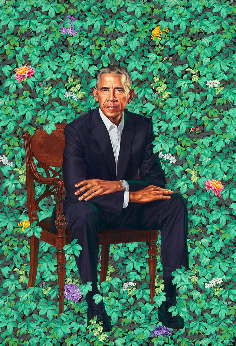
The Obama painting is dope, the Michelle one is pretty weak though..
-
Speaker to Animals
- Posts: 38685
- Joined: Wed Nov 30, 2016 5:59 pm
Post
by Speaker to Animals » Mon Feb 12, 2018 1:40 pm
Trump should commission a painting of himself holding Kathy Griffon's severed head.
-
BjornP
- Posts: 3360
- Joined: Thu Dec 01, 2016 9:36 am
- Location: Aalborg, Denmark
Post
by BjornP » Mon Feb 12, 2018 2:29 pm
Must remember to slim yourself on canvas, for posterity.

Fame is not flattery. Respect is not agreement.
-
SuburbanFarmer
- Posts: 25287
- Joined: Wed Nov 30, 2016 6:50 am
- Location: Ohio
Post
by SuburbanFarmer » Mon Feb 12, 2018 2:35 pm
pineapplemike wrote:The Obama painting is dope, the Michelle one is pretty weak though..
Honestly, how is that dope? (let alone 'Presidential')
It looks washed out, with zero depth.. He did some nice work on the face, but that's about it.
-
Speaker to Animals
- Posts: 38685
- Joined: Wed Nov 30, 2016 5:59 pm
Post
by Speaker to Animals » Mon Feb 12, 2018 2:38 pm
Might as well have gone with Britto.

-
K@th
- Posts: 3513
- Joined: Wed Nov 30, 2016 8:39 am
Post
by K@th » Mon Feb 12, 2018 2:40 pm
There is a picture that shows it less washed out, but it's still not anything I would call presidential. The face looks great, but him sitting among overgrown greenery is just odd.

Account abandoned.
-
Speaker to Animals
- Posts: 38685
- Joined: Wed Nov 30, 2016 5:59 pm
Post
by Speaker to Animals » Mon Feb 12, 2018 2:44 pm
I mean.. for the first gay president not counting Buchanan, I guess it's appropriate. But shouldn't Michael's portrait be more muscular in style?
-
SuburbanFarmer
- Posts: 25287
- Joined: Wed Nov 30, 2016 6:50 am
- Location: Ohio
Post
by SuburbanFarmer » Mon Feb 12, 2018 2:45 pm
Kath wrote:There is a picture that shows it less washed out, but it's still not anything I would call presidential. The face looks great, but him sitting among overgrown greenery is just odd.

God, that's even worse. He's got a glaring light source on one side of the face, that doesn't affect anything else in the frame. Then a nose shadow going the other way. It's garbage.
-
Montegriffo
- Posts: 18718
- Joined: Wed Nov 30, 2016 7:14 am
Post
by Montegriffo » Mon Feb 12, 2018 3:07 pm
GrumpyCatFace wrote:Kath wrote:There is a picture that shows it less washed out, but it's still not anything I would call presidential. The face looks great, but him sitting among overgrown greenery is just odd.

God, that's even worse. He's got a glaring light source on one side of the face, that doesn't affect anything else in the frame. Then a nose shadow going the other way. It's garbage.
Nice big hands though.
For legal reasons, we are not threatening to destroy U.S. government property with our glorious medieval siege engine. But if we wanted to, we could. But we won’t. But we could.
